First, I just want to link to my sequential art blog from last year, where I have a ton of examples of webcomics I've read - though many are just single pages optimised for print more than web - they're generally webcomics because of the online community and accessibility, not the literal affordances of the medium.
Hobo Lobo of Hamelin
This scrolls sideways and uses parallax and a bit of animation (as well as music) which is really cool! It also has nice colours and sketchy style with lots of contrast. The actual site around it kind of draws away from it though? (background colour, clunky buttons, narration below it) This page is particularly pretty. I love the way the canvas tapers at the end like a brushstroke, too.
Admittedly, I don't really actually read the narration/get too into the story, just scroll through it because it's cool.
The creator also has a page with tutorials and how he's made it.


The creator also has a page with tutorials and how he's made it.
To Be Continued
I haven't read past the first few chapters of this, I just found it searching for webcomics that take advantage of the web - it's interesting in that when you scroll, it starts by going down, but then also goes sideways and diagonally and all sorts of things. In one episode the screen is literally a facebook interface in which you can scroll down the feed and the chat (shown in this article). In another there's an animated video. This episode is a particularly good use of the infinite canvas

Tim Gibson's Moth City
I really like how this is subtly animated - like a storyboard revealing more bits (panel delivery), rather than actual animation. I actually went to a workshop with him at the library a few years ago where he talked about his process.
The panel delivery is done fairly simply mechanic-wise - every 'page' is actually technically about 4-10 pages, and the whole comic is on the main mothcity.com page, and you use the arrow keys to go through them, so it looks like you're on the same page and things are being added to them. It therefore, has an interesting way of changing the pacing slightly from having one page, then you click/turn to the next page - because you're clicking each time, it's more streamlined - though of course some pages have many separate panel deliveries and some have few.


He also does a nice thing with narration appearing in a panel, then that panel being filled with an image.


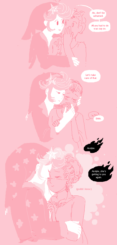
Lady of the Shard
This uses vertical infinite canvas, and is viewed full screen - it's mostly in the centre of the screen, simple pixellated lineart, but as the story goes on it explodes out everywhere and uses red tones as well - it's a good example of how the narrative and composition are just as important as Good Art, as I found it super engaging and read all of it in one go (and would read again) unlike the ones above (not that this isn't good art - it's just very simple). A lot of personal preference comes into that too, as all the characters are female and queer which is a reason I'll read a story.
Josie and the Whales
A comic/ebook with sound and other digital aspects - it's mostly just static illustrations with audio files. I will ask Caroline more about this in class next week probably. She calls it a 'screened book' - it's not technically a webcomic as it's not in that context, and it's aimed for younger audiences and utilizes a lot of audio

Never Mind The Bullets
I can't find this online but there's a video at the link. Another example of parallax, though it seems kind of overused in this - or maybe it's just the video format. I think this is relatively old.
Social media as a medium:
Some webcomics (also a lot of webseries) have characters with real social media accounts - this is not generally a part of the main narrative, but something extra that adds details to the character or worlds. It's also a great example of interactivity, as you can "talk" to the characters (even if you're actually talking to the creator)Here are two examples, from the comics Griefer Belt and Project Nought:


People who are Patrons of Project Nought can get a "selfie" with mars.
Lights' Skin&Earth map on instagram

Years & Years' album annoucement - which is still ongoing - sets up an automatic thing on messenger which reveals some of the worldbuilding in the dystopian world the album seems to be set in (it's unclear at this point) Because it uses messenger which is alongside your real chats with real people it feels more real somehow, even though it's a fictional.
and it's now shifted to an instagram story (can be viewed in the story highlights). This is more of a promotional thing as far as I know, rather than an actual story but I think it's interesting


No comments:
Post a Comment