Sunday, 29 April 2018

These didn't end up being so relevant, but I grabbed a few quotes from the intros, mainly.

Nakevska, M., et al. "Interactive Storytelling in a Mixed Reality Environment: The Effects of Interactivity on User Experiences." Entertainment Computing, vol. 21, 01 June 2017, p. 97-104.

Vakulenko, Svitlana, et al. "Conversational Exploratory Search via Interactive Storytelling." 2017.

Jardim Nunes, Nuno, et al. Interactive Storytelling: 10th International Conference on Interactive Digital Storytelling, ICIDS 2017 Funchal, Madeira, Portugal, November 14-17, 2017, Proceedings. Cham, Switzerland : Springer, 2017. Lecture notes in computer science: 10690.

Saturday, 28 April 2018

Tristam mentioned picking a topic i'm interested - for example 'dreams' like Little Nemo and it got me thinking, I do really like stories that are someone going into a fantasy dream world, portal fantasies, etc, and that a lot of the examples I've been looking at do have that theme.


  • Little Nemo in Slumberland obviously
  • The Land of the Magic flute has the protagonist crash his car and go into the lake, entering a magic land, and at the end swimming up to the surface and being rescued by ambulances etc and thinking it must've been a dream (but then seeing a tentacle slip back into the lake...)
  • Thunderpaw has characters also in a car crash, then find themselves in a weird creepy forest)
Having the contrast of reality/fantasy world is something that could really be played with style & layout & medium wise (as it is in the above comics)


Like Alice in Wonderland,


In terms of representation (lgbtia+ -wise, mostly), the majority of the comics I read have it as a normal, given thing, rather than something the comic is about - e.g. the main characters are lesbians and that's treated as normal and not any source of conflict, it's about normalizing them. So in whatever I do, I'll definitely have diverse characters, but it won't greatly affect what the story itself is about.


I also downloaded a whole lot of fairytale books (Andrew Lang's coloured fairy books mostly) to look for lesser-known fairytales I could possibly adapt, and have found a few that interest me, though I'm

Second Showing (week 7)

My presentation - it's basically the same as last week, I just added some more details. And I finished my Mistlands parallax


I chose the inform group because that's basically what comics and storytelling is, a device used to inform people, about whatever the story happens to be about. I suppose it's mostly about interaction and direct exchange, as well as being subjective (depending on the narrative?). In our group we didn't discuss very much how it informs or what kind of informing it is in specifics - because on the surface level it's fairly straightforward.
I didn't get that much feedback from talking to other classmates to be honest; most people seem to think I've got my direction and know where and going, and that it's all clear - which it is to an extent, I just need to figure out what my story is going to be about which will open up more need for research into different areas. I also need to do more detailed research into the things I'm already looking into - what I put up in my presentation is fairly simplified (so I don't have too much text up there.

When talking to people, they mostly brought up how it's very cool and interesting, and they like interacting with it (possibly because they haven't seen my project before), as well as suggesting other cool examples and different areas of webcomics, asking about the overlap of print and web comics - questions about the broad topic rather than specifics. This probably indicates I need to present more succinct detailed information.
I had a few people suggest that my narrative could somehow involve, conceptually, the idea of digital forms of storytelling. Someone also got me thinking that I could create a story in which part of the narrative is a webcomic and part of it is print - like a dual narrative, or from different POVs, and show how the different mediums can be used? I think that's a little off topic and would require a bit of rethinking of my project. My main goal now is to figure out what my story is about, and at least have a more specified and solid direction for that.

Friday, 27 April 2018

notes

what you need & will have to go forward
inform - imperitaves, education, instruct

design issues in research to date

essential/interaction - direct exchange
formative/subjective
informing - storytelling is an informative device


precedents of types of comics like what i'm interested in

The Language of New Media Lev Mavovich

pull back up- interaction design and media design
& narrative

block out points

be conscious about practice


exploring interactivity to enrich storytelling

Thunderpaw

Finn showed me this cool comic called Thunderpaw which has simple animation on every page, and some pages break out of the frame.

Best friends Bruno and Ollie are lost. As they try to survive and search for home together, the world around them continues to crumble.

The simple looped gifs and squiggly animation gives it a real sense of anxiety, (or calm, in some places) which really suits the energy of dogs, I think? (the main characters are dogs)

The way it's only used in certain panels, not all of them, is nicely done, creating more focus there, or a contrast between dream and reality, etc. The animation is on every page, but is fairly simple and not overdone - the simple, monochromatic art style means it's not too busy and annoying.

Another nice detail is that the background colour of the web page is the same colour as the background of the page - so the panels don't look like they're on a page at all, and it's also a very simple but effective way of changing the mood. Some 'pages' are long, and some are short - effecting the pacing of the overall story.


Thursday, 26 April 2018

Ruben and Lullaby

Here's something I found mentioned in Digital Storytelling - an app/short story called Ruben and Lullaby I don't think it's available anymore, but here's a video:

it's very short, and is just about a couple having an argument - you tilt the screen to go between characters, and shake it to make them angrier/rub it to calm them down. It's a bit choose your own adventure in the sense that it has multiple endings depending on if you make them angrier or not.


Tuesday, 24 April 2018

Parallax

I finished the mistlands parallax page! It's here. I may look at making the images a bit smaller - though I think I've made them as small as I can without losing quality (there are white pixels showing on the edges) I may yet add some more fae peeking out from behind corners, but it needs to go up on patreon on Thursday and public on Monday, and I need to work on other things. I can add them at any time if I want.


I also just got a new phone, and tested it on mobile too: 

It's obviously not quite right dimension wise, but it works!

Monday, 23 April 2018

The video Fiona wanted to show me was this - which is interesting, it's not really a comic or anything, but she thought in terms of narrative (how it follows a coin) could be relevant to my work somehow, considering I'm not sure on my story yet.

Saturday, 21 April 2018

Second Showing


Second showing went really well! Apparently not many people knew about it, so I suppose I was more prepared?
  • Not many people had questions because my idea is pretty clear. A few people suggested some cool comics to look up but I can't find them (so far).
  • A few people suggested that choose your own adventures are cool. 
  • Also suggested thinking about the web community / live aspect of it, and having people contribute to the story, using patreon somehow.
  • Affordances of the web: the community, and how people use it


Thursday, 19 April 2018

Comic Example: Circuits and Veins


Circuits and Veins is another webtoon comic - optimised for scrolling down, and episodic. Again, it has a nice use of pacing. The occasional narration (such as on the episode above) is spaced out nicely, making it almost cinematic - most other episodes have only speech bubbles, and it's more casual and slice-of-life like.

Comic example: Lore Olympus

Lore Olympus is a rewrite of Hades and Persephone, set in modern times. The comic actually recently rebooted and is being redrawn, so there's less out than there used to be.

Lore Olympus uses infinite canvas - the vertical kind that many webcomics use, especially when hosted on sites like webtoon or tapastic, which are built for it. The episodes are fairly long, space-wise, but it the panels are fairly spaced out in a way that makes it very fast paced. This is a section from the end of the second episode:


textures and lines (like the pink rosepetal splatters) are often used to create flow and guide the eye.

It's also optimised for viewing on mobile phones - the text is large and readable, and it suits a vertical layout (on desktop it has white space at the edges and you can't see all of some panels in one go)
(this is a phone screencap - whereas the above were zoomed out on my laptop)


Scrollpath on the nemo comic

After testing it with a few people I decided it would probably work a lot better on a scrollpath, so I got the demo from here and tried to figure it out (it took a while because there was a stray bracket for some reason) - but eventually got there! I had to get rid of my viewport height sizing, so it might not work so well on bigger screens, but I think this is better.


Once I got it working with the straight lines, I tried out the arcs, because I thought that'd be smoother - it took a lot of entering different numbers to get the arc to go in the right place.


zoomed out so i can see the whole path better


the final is here, and the older version is here


Wednesday, 18 April 2018

Tested little nemo with Kez - they tried to scroll down at first so that's something to fix maybe. They thought it was very cool and liked when it went into the falling bit

Sam also tried to scroll sideways, half way down the mushrooms

-so it definitely needs a scrollpath, I think

Tuesday, 17 April 2018

playbyplay / florence

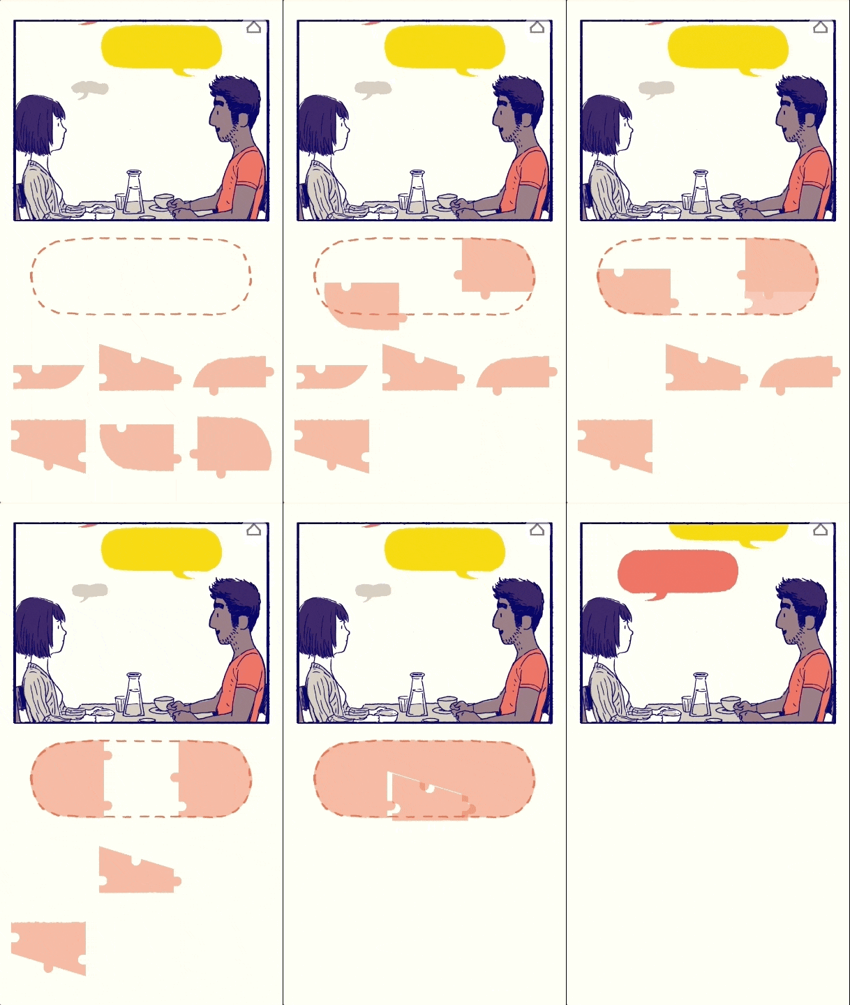
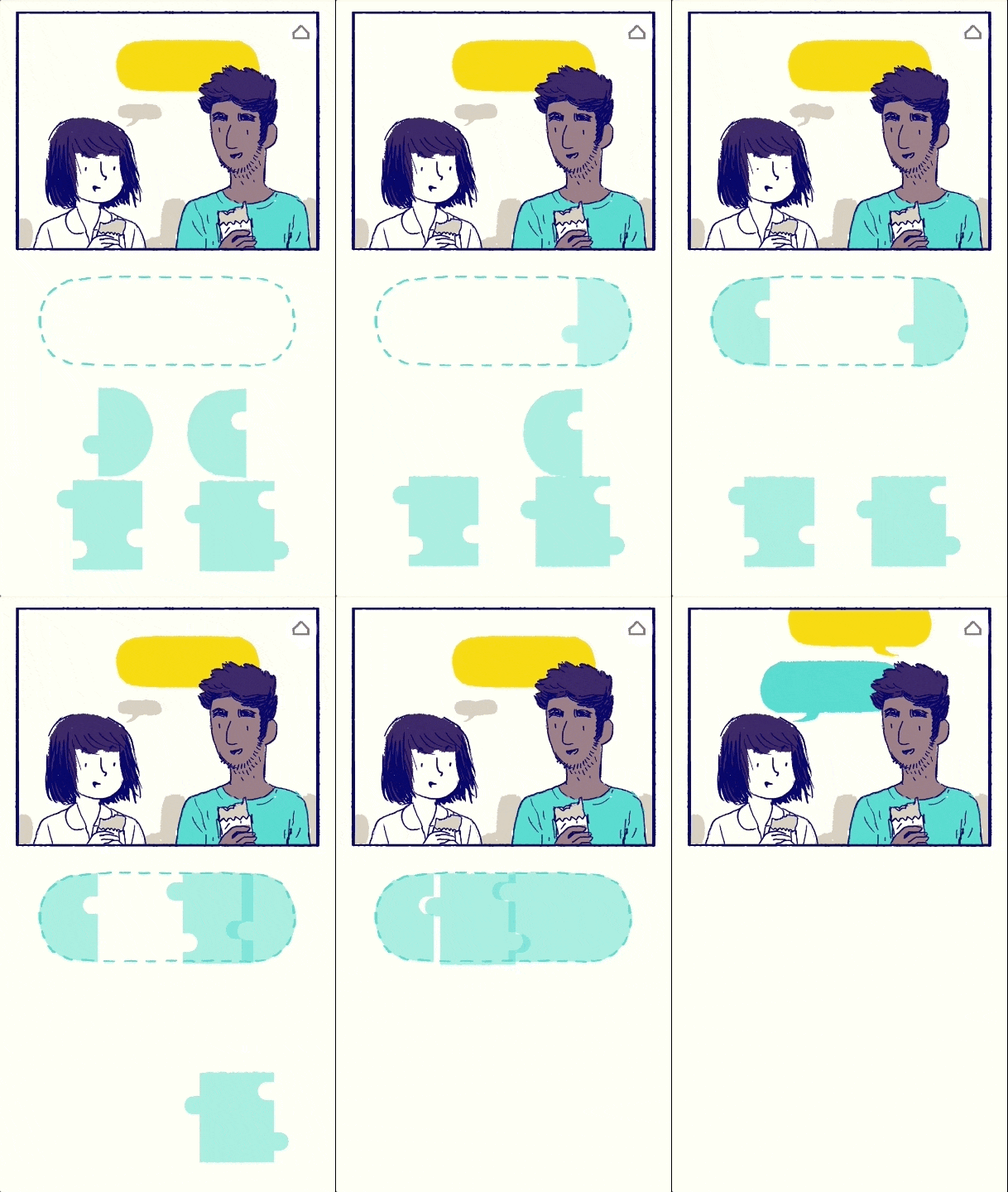
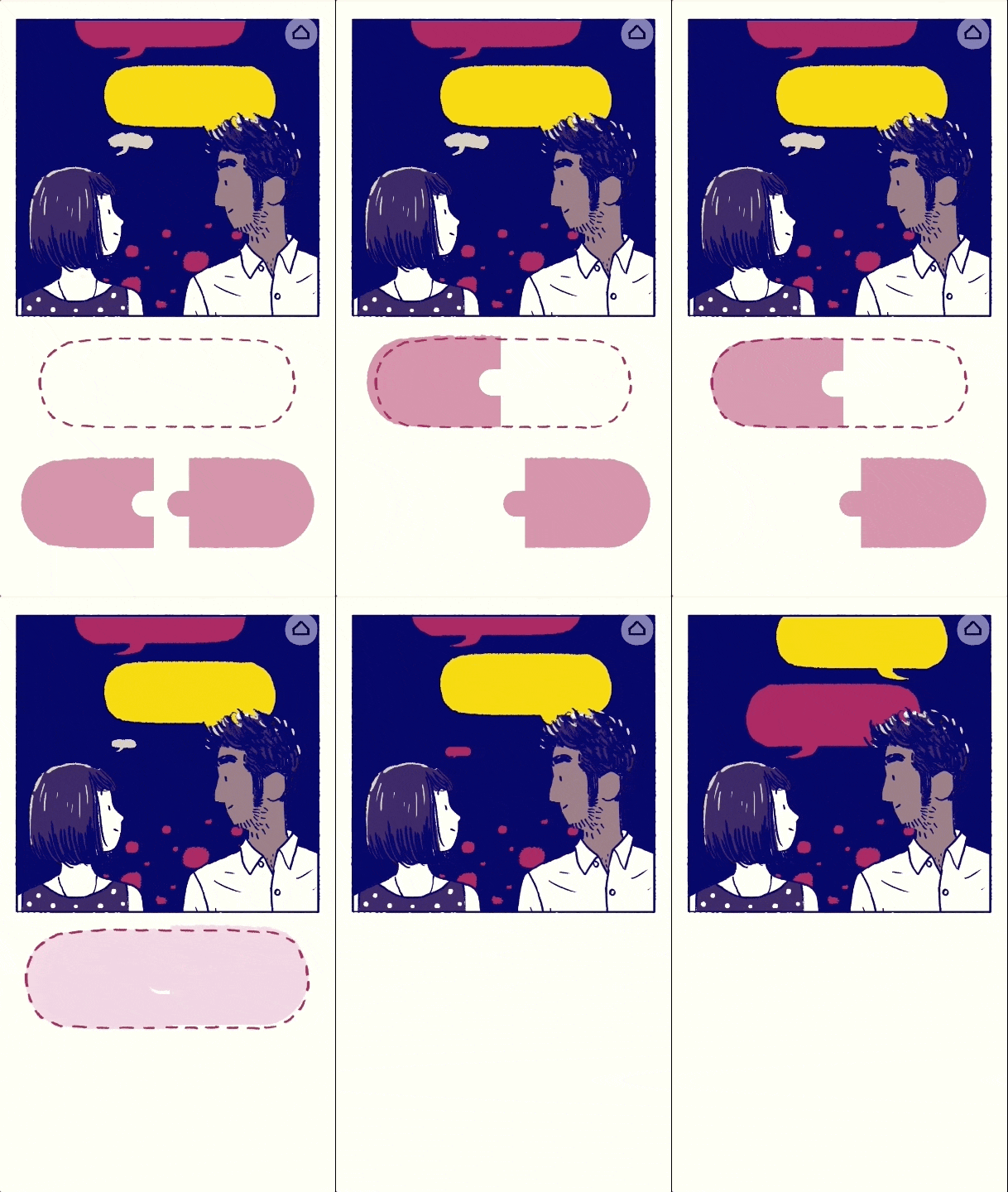
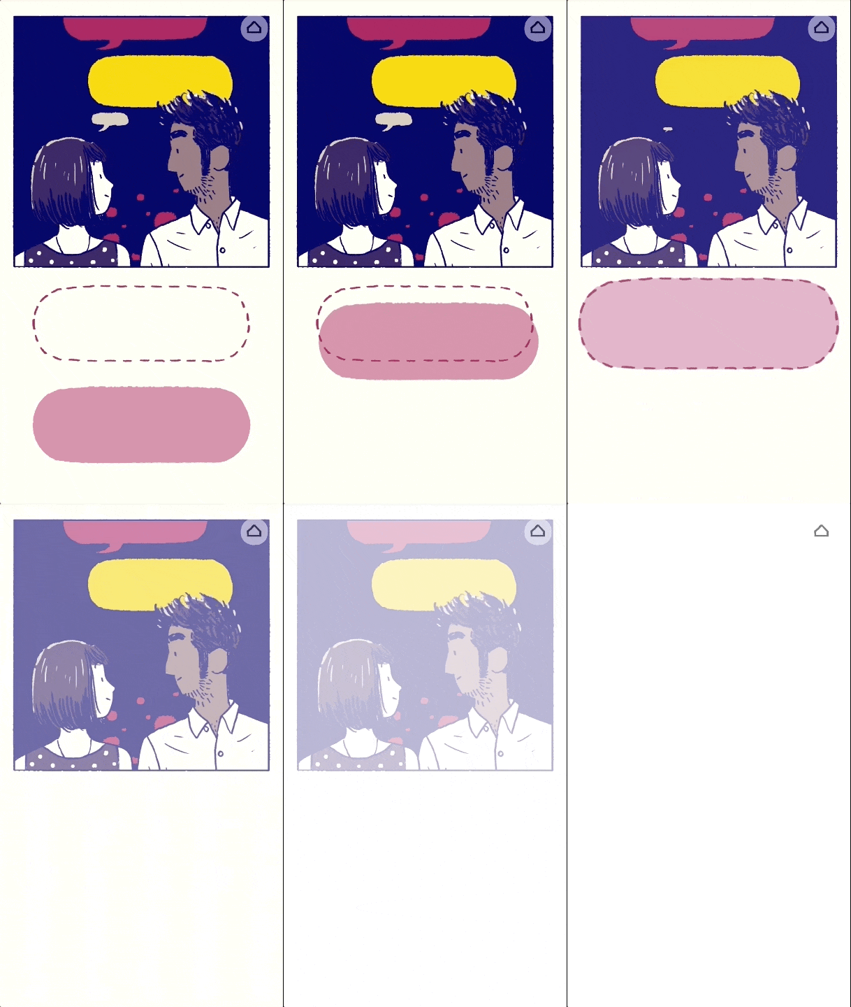
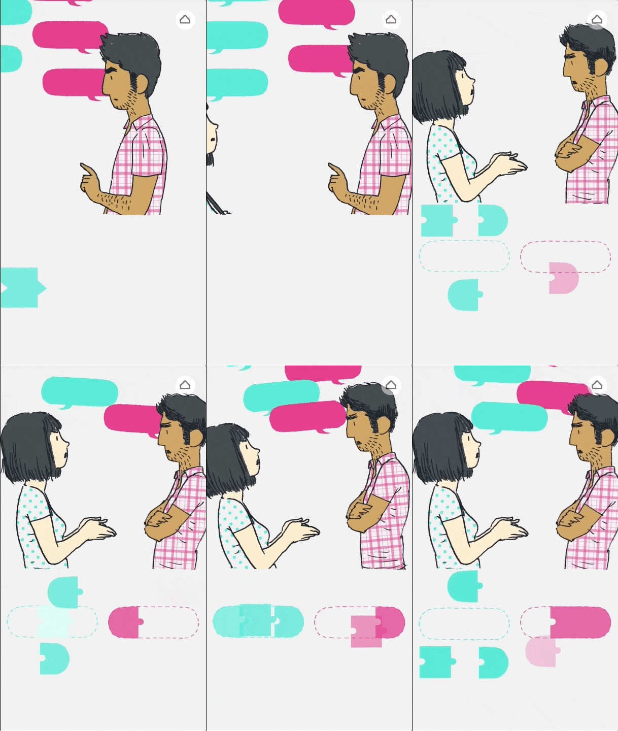
Today I went to the Play By Play fest exhibiton at Wellington Museum - there were some cool games, including Florence, which is more of an interactive comic than a game? Or I guess, is somewhere on the line between them.

Here's the trailer:
And full gameplay:


It's more or less a slice of life comic, with simple graphics. It requires swiping across or pressing a button to move on. And the 'game' parts are mostly things like 'brushing' your teeth, 'painting' a picture, 'shaking' a polaroid, clicking an alarm clock, sorting out items to 'clean' a room, etc. Things that are inconsequential, about the story and the feeling, rather than winning the game or anything. The way they mimic the realisic gestures is a really nice aspect of the interactivity.
There's some really nice subtle use of parallax in the more comic-like structured parts.

The interactivness creates a really nice experience, drawing you into the story even in very mundane, simple tasks.

This article Designing Emotional UX discusses how the UX creates an emotional response in the reader, and how that's important - and how the different ways Florence uses it in order to portray the scene from the main character's point of view, engaging the viewer and making the reader feel like they're part of the story

A section from the article:


The date begins, and just like in real life, you’re trying to figure out what to say. It’s a puzzle: “Do I mention the cat? Is he ever a cat person? What if he hates cats? I’ve been quiet for a while. I should say something”.

As the conv
ersation moves forward, it gets easier. Finding the right thing to say gets easier, quicker. You don’t have to think about it too much, because it just ‘makes sense’.

And finally, it eventually just clicks. It’s a perfect simile for this, and it’s such a beautiful way to portray this feeling in a user interface. It’s emotional, and human.


Later, when you have your first big fight, the mechanic is used again in a new, unique way:Just like your words, the puzzle pieces are sharper, more aggressive as the fight goes on. It feels like a race to say your piece, to get the last word in, to overwhelm your opponent.

(note from me: this is really effective when you're playing it, especially the way the rocking starts subtly and gets stronger and stronger, and the way the screen starts moving back and forth between the characters and showing them moving apart


Genuine emotional connections are the lifeblood of any truly memorable experience. It’s certainly not always going to as dramatic as Florence, but there’s still so much we can learn from this.

Next time you’re designing a sign up form, make the user really feel a sense of achievement for having filled in all 21 fields. If they’re posting a photo, make their contribution feel valued.
Good products make us feel something, and great UX should too.


Monday, 16 April 2018

I managed to find out how to do a scroll path like this episode of to be continued - I looked in the inspect and found this in the scripts and then found this. which I'm not sure how I didn't find by googling for it earlier, but I guess I didn't have quite the right keywords. I will have a look and try to see if I can apply it to my little nemo comic tomorrow.

Mistlands parallax update

I've been slowly working on this. 


The idea is for it to be a transition between these two pages:


Which I would have liked to have had a little more 'walking time' in between, but it would've meant a whole extra spread, because the one on the right is a spread and I wanted to keep it like that. It's also in a part of the story which is more fast paced and I didn't want a bunch of extra stuff in there. - But, the parallax works really well for a bit of walking through the forest, a transition from the darker part to the bright Seelie Court, and as something that's a little nonlinear (because faerie forests are confusing) and also I can hide things behind other things (like faeries watching them from behind trees)


Here's the individual layers:


I'm also hosting these on my website because the files are too big for tumblr or dropbox, and end up pixellated. When I do the final I'll make the files as small as I can while keeping the quality, because they take a long time to load at the moment,...


Saturday, 14 April 2018

Some fairytales I've looked at

http://web.tiscali.it/spazioacqua/Racc%20irlanda1.htm the captive princess

http://www.libraryireland.com/AncientLegendsSuperstitions/Edain-Queen.php the cave fairies

https://www.worldoftales.com/European_folktales/Irish_Folktale_34.html  a chapter that you can skip

https://www.worldoftales.com/fairy_tales/Charles_Perrault/blue_beard.html bluebeard

https://www.cs.cmu.edu/~spok/grimmtmp/013.txt three leaves

http://www.libraryireland.com/AncientLegendsSuperstitions/Ethna-Bride.php ethna the bride
Distinguishing Mediality: The Problem of Identifying Forms and Features of Digital Comics

Lukas R.A. Wilde,2015


identifying different modes in specifics is less relevant than how they're used and how it's important, it's complex

talks about how infinite canvas isn't 'new' - it's a way of making historial storytelling like trajan's column, cathedral ceilings, accessible. McCloud, Bukatman

print has pages by necessity, and that has created principles of pacing, rhythm and panel delivery > connected to hyperlinks, in digital this same concept has more flexibility
-and digital comics are a new reference point that allows people to think more about the theories and properties of print comics

feature common of all webcomics i: higher degree of flexibility to choose own forms and limitations - mediality is becoming more fluid

highlighted notes under cut:

Thursday, 12 April 2018

Little Nemo in Slumberland - adapting for web.


First I very roughly sketched out the layout (the vertical bits would be connected, I just didn't have the room in my sketchbook)


Then I plotted it out in photoshop, using the images from the original comic and artboards the dimensions of the screen to I can see what the image in the viewport would be. Ideally when putting it online, I'll tie the scaling to the viewport size so it's always about the same no matter the device.

I then drew over it with the flow, and bits I need to redraw. The dream section will take up the full screen, and the start and end still in the panels - to emphasise the normal world/dream world. Having the dream world part image instead of divided into panels means redrawing some of the middle section, also 'widening' the panels.


I then redrew the panels: (with as much tracing and copy/pasting as possible)


and also added the text in PS - I may remove the narration text in the final? it's kind of not needed.


I then saved the artboards as one big image, and put it into a site. I wasn't sure initially whether I'd put them into separate boxes - which could possibly mean I could get it to scroll to those points? But I decided one big image is simpler for now to test out the scale. I used vh and vw on the dimensions to lock it to the viewport so it fills the screen right no matter the screen size or zoom (though it may not work for vertical/mobile screens)
I checked the widths of the sections in the dream part, so it read well.


I then did the lines for the first section and again tested it in brackets.


/////

I'm not sure about having the narration go to the top here - it's out of line with the first two, but I can't have it below because that's where the dream section starts and it would break that flow. it also makes more sense to be read before you read the panel. maybe i could put the other narration on top? or remove it?

 This section I spaced out horizontally a lot more than the original - considering he walks for a while between then. I could have probably spaced it out more, but i didn't want to draw too much extra.... In any case, this gives it more 'time' than the original comic, which goes straight into the next panel

For the falling section - because the screen is horizontal it doesn't quite have the same falling effect as the tall panels in the original, although of course the scrolling does that. It emphasises more the chaos, which I think is just as important

at the end the white space takes over, representing him waking up from the dream and it goes back to the normal panel for the end


/////
I also put this online! http://layaart.tumblr.com/littlenemo it doesn't work very well when I tried to look at it on my ipad but I kind of knew it wouldn't. If I end up editing the way it's structured in the code I'll make sure it works for mobile too.